Send crypto to a friend
Reading time: 7 min
Client: Kriptomat
My role: Entire product design from research to conception, visualization, and prototyping
Project duration: 5 days
Tools used: Figma, FigJam
Brief
The brief was provided by the Kriptomat team.
Task
Sending Crypto via 3rd party Apps
The objective of this feature is to enable Kriptomat users to easily send crypto tokens to their friends or contacts directly through their preferred communication apps. This feature aims to enhance user engagement and facilitate seamless transactions among users, whether they are already on the Kriptomat platform or not.
Goal
By incorporating this feature, Kriptomat aims to provide its users with a convenient and efficient way to send crypto tokens to their friends and contacts, thereby fostering a more connected and user-centric crypto exchange platform experience.
My goal was to design a user-friendly interface with consistent branding and implement security measures to ensure smooth and safe transactions.
User persona
Name: Marko Novak
Age: 42 years old
Occupation: Marko is an IT manager at a mid-sized company. His job involves overseeing the technological infrastructure of his organization and ensuring that everything runs smoothly. He has a good grasp of technology but is not necessarily an expert in cryptocurrencies.
Marko represents a typical user of Kriptomat in his age group: a technology-savvy professional who seeks a simple, trustworthy platform for long-term cryptocurrency investment, without the need for deep expertise in the field.
Process
1. Inspirations
Following project briefing, I explored transaction flows within various apps. I was looking for simple, easy and clear interfaces. Apps like Revolut, NLB Flik, PayPal, Google Pay, BlockChain, Binance and others caught my attention the most.
2. User flow
Once I grasped the essence of the challenge, I defined user flow to gain a comprehensive understanding before I proceeded to the next step. This helped me understand how many steps are required for users to navigate through the flow.
3. Screens
With user flow defined, I proceeded to determine the necessary screens for seamless navigation. Distinguishing existing screens (lime color) from new screens that need to be designed (purple color) helped me organize the design process further.
Screen structure
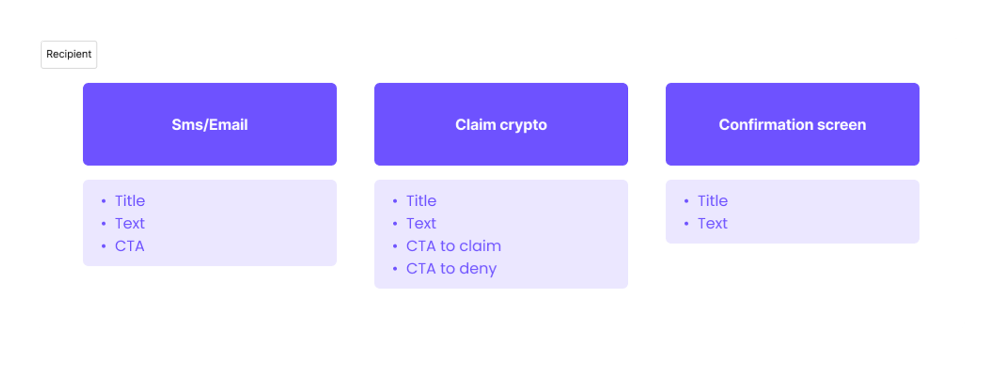
In this step, I was also determining essential elements for each screen. This involved specifying every element for each screen, ensuring every interface has all the necessary elements required to seamlessly progress further in the user flow.
4. Wireframes
At this stage, I began sketching initial wireframes. While anticipating numerous changes in the final design, my objective was to establish a clearer understanding of the layout and composition of elements on each screen. This process aimed to align user flow with user’s needs, so Marko representing the target user was in front of my mind throughout the whole process. The challenge was to minimize the number of steps while maintaining a simple flow.
After rough sketches, I transferred wireframes into Figma to define elements and composition. I iterated through a few different versions before deciding on the final one.
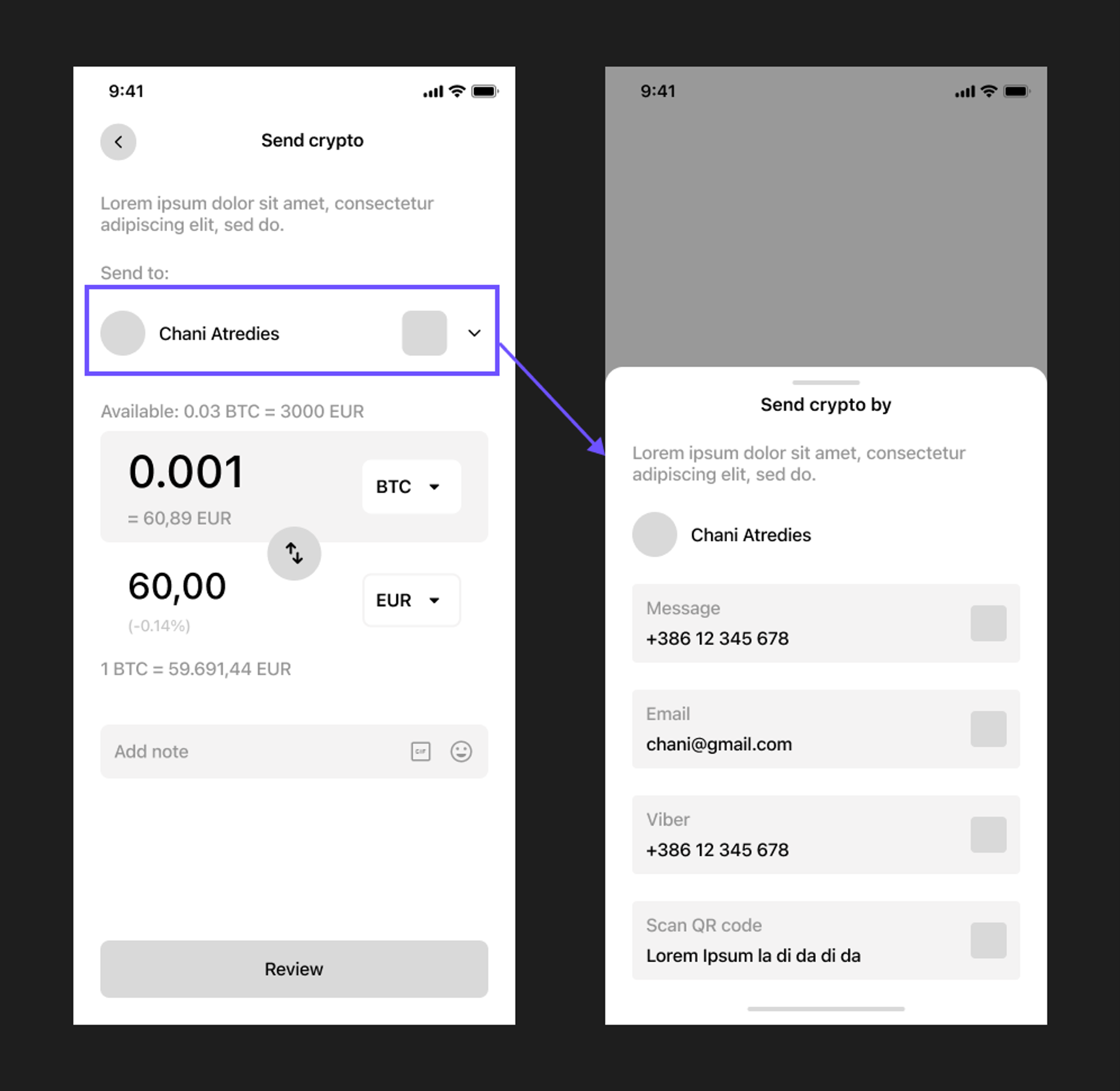
One of the main challenges was to decide what way ‘Choose the sending method’ is going to be presented. Because I was working on minimizing the number of steps, I decided to put it on the ‘Transaction’ screen. Additionally, the first contact information, typically a phone number, is automatically selected for added simplicity.
After wireframes received confirmation from the Kriptomat design team, with just a few minor comments, I felt reassured that I was moving in the right direction. This validation encouraged me to proceed confidently with the design process.
5. Final design
Design system
I used a design system provided by the Kriptomat design team, which prominently features bold colors such as purple and lime for CTAs and to emphasize crucial elements.
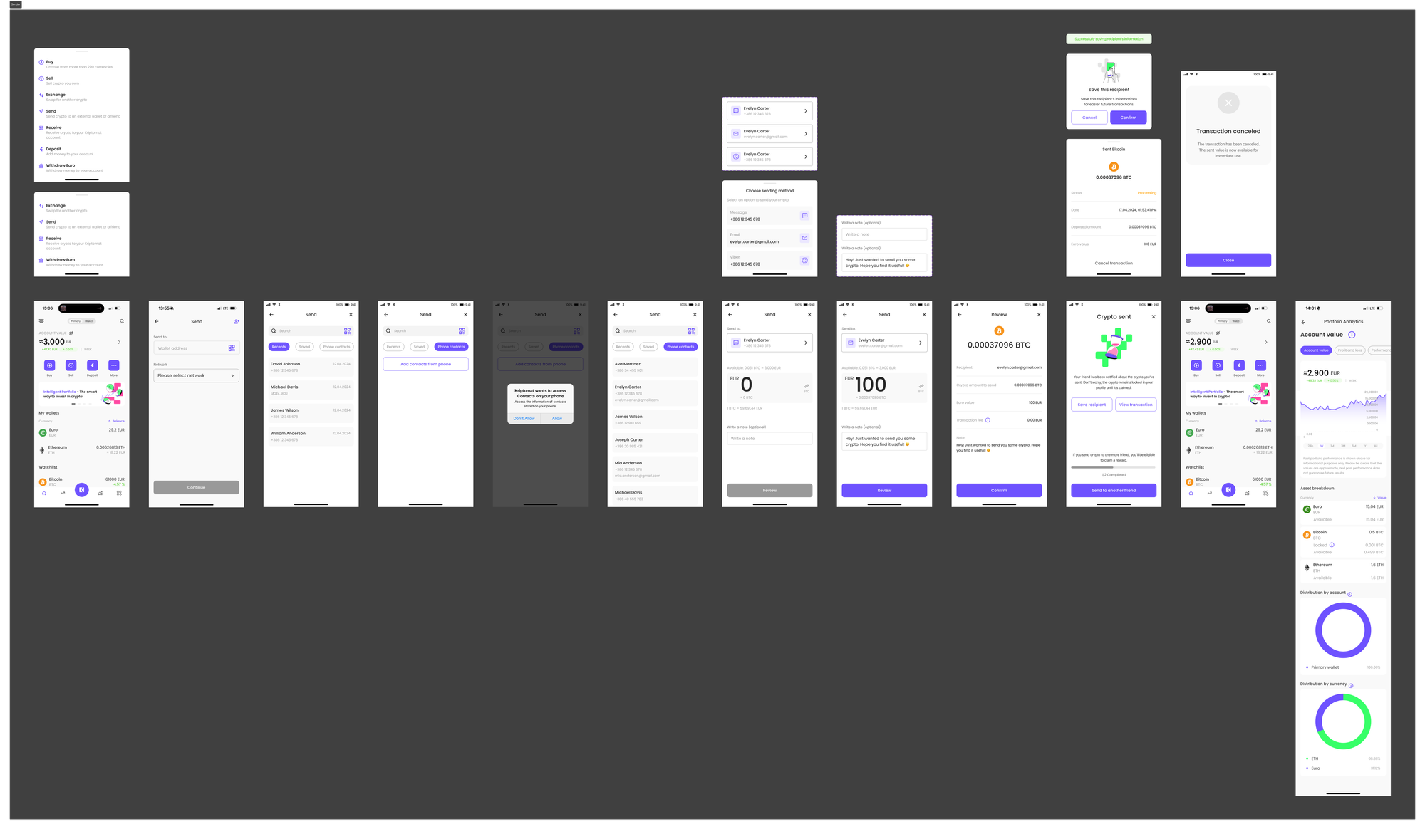
Final design
Armed with all the necessary resources, I was excited to dive into designing the screens. The objective at this stage was to craft a design that not only aligns with Kriptomat's branding but also prioritizes user-friendliness, to ensure smooth transactions for all users.
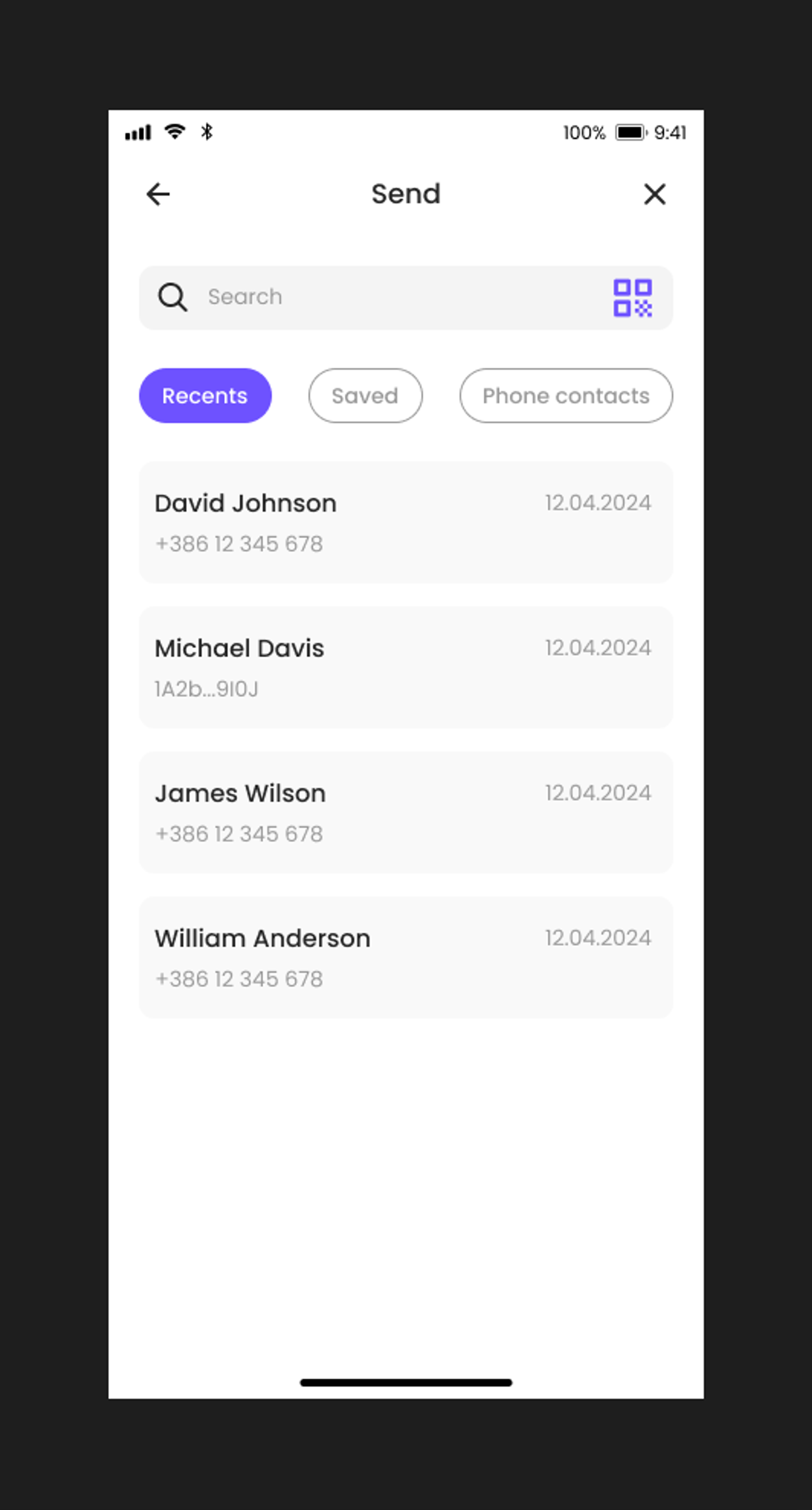
One of the main challenges I encountered in this step was how to present contact sections (Recent, Saved, Contact from phone) on a single screen. I figured there could be plenty of contacts within each section, so I organized them into tabs, enabling seamless toggling between sections. This approach ensures all contacts are combined in one location while maintaining ease of navigation through the sections.
The second issue was determining a course of action if the recipient failed to claim the transaction. To prevent loss of value, the sent amount remains in the sender's wallet until claimed by the recipient. Additionally, the sender preserves an option to cancel the transaction at any time before it’s claimed by the recipient.
This solution presents a new dilemma: if sent crypto remains in the sender's wallet until claimed by the recipient, how can the sender track their available balance? The sent value is essentially inaccessible until the transaction concludes (i.e., the recipient claims it) or the sender decides to cancel it. In case of cancelation, the sent value reverts to the available state. To address this, the 'Transaction' screen displays an available balance, and 'Account value' displays both locked and available balances, ensuring users are aware of the value they can utilize.
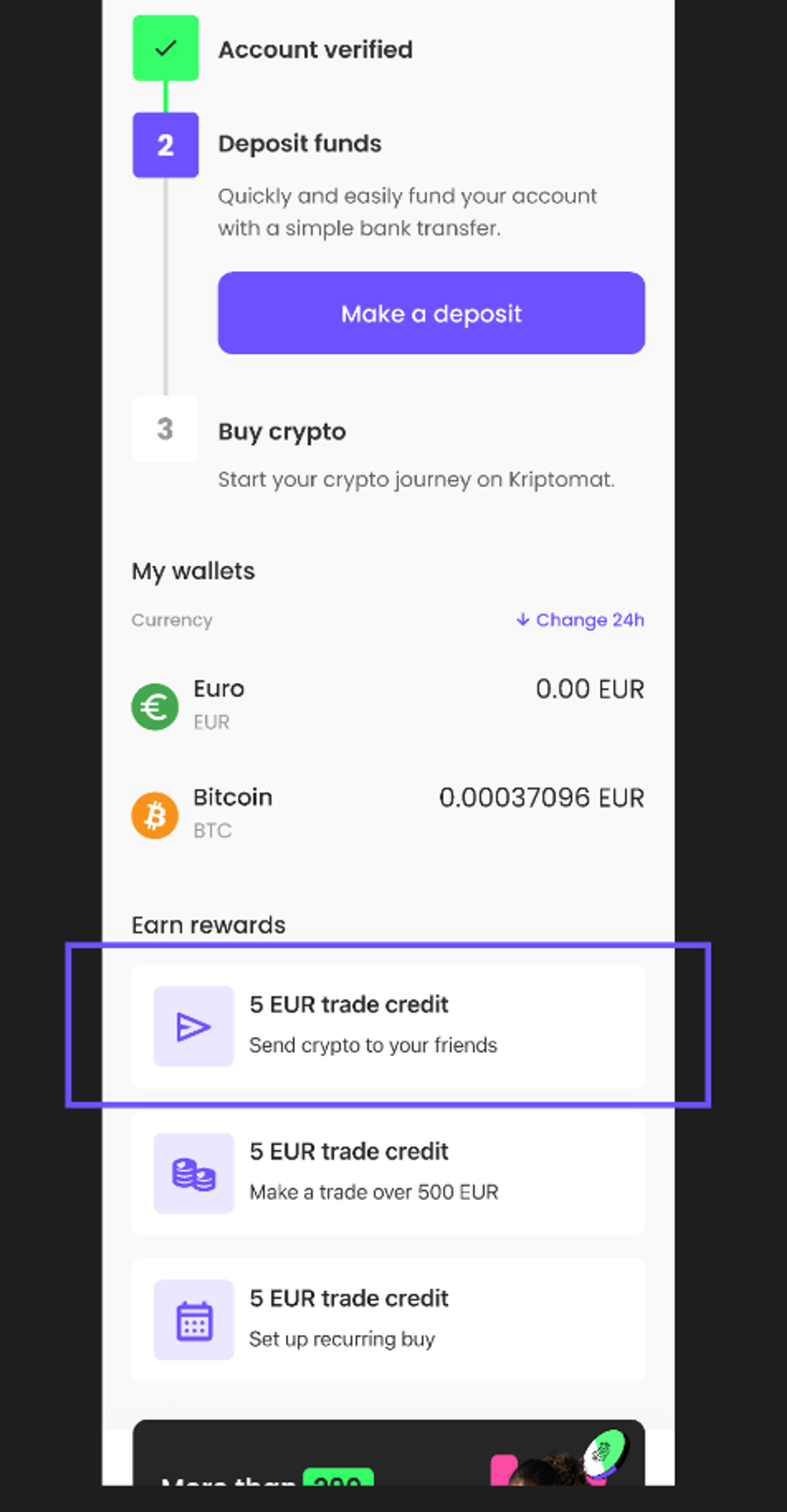
The last problem I was facing was to effectively promote this new feature to the users. We anticipate that this strategy could attract more newcomers to the app. Integrating a task within 'Earn the reward' section and rewarding users to use this feature, could improve the revenue.
Final design
6. Prototype
Finally, the time for prototyping has arrived. This is one of my favorite steps in the process, alongside designing, as it brings everything together and makes the design feel tangible. It’s a functional prototype that can be used for presentation and user testing.
Prototype (Sender flow and Recipient flow):
7. Next steps
After receiving confirmation from the Kriptomat team on the design, I would proceed to prepare scenarios for user testing. The prototype would then be tested with at least five users to get representable patterns. Based on their feedback, I would prepare adjustments and improvements in the design. Afterward, I would also provide a responsive design that could be implemented across all devices to ensure optimal user experience. The last step would be to prepare a handoff for developers. Post-launch, it's crucial to monitor user engagement with the new feature and make necessary improvements or adjustments as needed.
Throughout the process, my primary focus was on aligning the design with the needs and preferences of our user persona, Marko, ensuring that every decision made catered to his experience and expectations. Additionally, I paid close attention to maintaining branding consistency across all aspects of the design, ensuring that the visual identity of the app remained cohesive and recognizable to users.
Let’s make something great together! Contact me…
I am always looking for new opportunities and would be happy to help you with your project.


